拯救移动端图标 SVG
Iconfont
iconfont
icofont
fontawesome
Iconfont 相较于 PNG 的优势:
多个图标使用一套字体,减少获取时的请求数量和体积
因为网站会有很多图标,如果使用 PNG,每个图标都需要单独设计一个文件,这样浏览器就需要对每一个文件进行加载。虽然可以使用雪碧图来规避请求数量,但是这就需要关心 icon 的定位了
iconfont 就是一套字体,就只需要获取一套字体即可
矢量图形,可伸缩,可以直接通过 CSS 修改样式(颜色、大小等)
PNG 需要关注图片的宽度、比例,以避免失真、变形
Iconfont 缺陷:
- Iconfont 很难做到多色
- 浏览器和搜索引擎很难理解这个字体图标代表什么意思
这时人们就在想有没有什么方式类似 HTML,把这个图片描述出来,这样一方面可以显示图标,另一方面还能让搜索引擎理解这个代表什么意思。这时人们就把一项老技术 svg 翻出来了
svg
手摸手,带你优雅的使用 icon 这里使用 svg-sprite-loader 对 svg 进行处理
采用 @svgr/webpack 支持 svg 作为组件引用
1
| npm install -D @svgr/webpack
|
之后在 webpack.config.js 里配置即可
1
2
3
4
5
6
7
8
9
10
| module.exports = smp.wrap({
module: {
rules: [
{
test: /\.svg$/,
use: ['@svgr/webpack'],
},
],
},
})
|
在页面里直接使用
1
2
3
4
5
6
7
8
9
| class About extends Component {
render() {
return (
<main className={this.props.classes.root}>
<AddressCardSvg width={100} color={'#fa1010'}/>
</main>
)
}
}
|
svg优势:
- 保持了图片能力,支持色彩和复杂图标的绘制
- 独立的矢量图形,用哪个加载哪个
- XML 语法,搜索引擎 SEO 和无障碍读屏软件读取
使用 Flexbox 布局
我们把一个元素的 display: flex,这个元素就会变成 flex 容器
flex 容器有如下属性:
- flex-direction:容器的主轴的方向
- flex-wrap:是否换行
- flex-flow:上面两个属性的简写
- justify-content:主轴上的对齐方式
- align-items:交叉轴上的对齐方式
- align-content:多条轴的 flex 在交叉轴的对齐
子元素有如下属性:
- order:排列时的顺序
- flex-grow:宽度或长度的增长系数(容器空间多大时)
- flex-shrink:缩小系数(容器空间不足时)
- flex-basis:主轴方向上的初始大小
- flex:2、3、4 的简写方式
- align-self:交叉轴上的排列方向
float 与 flexbox 进行对比
使用 float 进行布局
display: inline-block:进行换行会 float: left 要快,但也没有 dispaly: flex 快
![]()
1
2
3
4
5
6
7
8
9
10
11
12
13
14
15
16
17
18
19
20
21
22
23
24
25
26
27
28
29
| <!DOCTYPE html>
<html>
<style>
.main {
width: 100%;
height: 1000px;
background-color: gray;
}
.box {
width: 100px;
height: 100px;
background-color: red;
margin: 5px;
float: left;
}
</style>
<div id="main" class="main"></div>
</html>
<script>
window.addEventListener('load', () => {
let mainNode = document.getElementById('main')
for (let i = 0; i < 100000; i++) {
let divNode = document.createElement('div')
divNode.setAttribute('class', 'box')
mainNode.appendChild(divNode)
}
})
</script>
|
使用 Flexbox 进行布局
![]()
1
2
3
4
5
6
7
8
9
10
11
12
13
14
15
16
17
18
19
20
21
22
23
24
25
26
27
28
29
| <!DOCTYPE html>
<html>
<style>
.main {
width: 100%;
height: 1000px;
background-color: gray;
display: flex;
flex-flow: row wrap;
}
.box {
width: 100px;
height: 100px;
background-color: red;
margin: 5px;
}
</style>
<div id="main" class="main"></div>
</html>
<script>
window.addEventListener('load', () => {
let mainNode = document.getElementById('main')
for (let i = 0; i < 100000; i++) {
let divNode = document.createElement('div')
divNode.setAttribute('class', 'box')
mainNode.appendChild(divNode)
}
})
</script>
|
Flexbox 优势
- 更好性能的实现方案:使用 Flexbox 布局在 Layout 和 Paint 耗时小于其他布局方式
- 容器可以决定子元素的几何属性:大小、顺序、对齐方式、间隔等
- 双向布局
1
2
3
4
5
6
7
8
9
10
11
12
13
14
15
16
17
18
19
20
21
22
23
24
25
26
27
28
29
30
31
32
33
34
35
36
37
38
39
40
41
42
43
| <!DOCTYPE html>
<html>
<style>
.flex-container {
display: flex;
flex-flow: row wrap;
justify-content: space-around;
}
.flex-card {
width: 200px;
height: 200px;
display: flex;
justify-content: center;
align-items: center;
}
.flex-card-number {
font-size: 120px;
color: white;
}
</style>
<div id="flex-container" class="flex-container"></div>
</html>
<script>
function generateRandomColor() {
let r = Math.floor(Math.random() * 256)
let g = Math.floor(Math.random() * 256)
let b = Math.floor(Math.random() * 256)
return 'rgb(' + r + ',' + g + ',' + b + ')'
}
window.addEventListener('load', () => {
let containerNode = document.getElementById('flex-container')
for (let i = 0; i < 10; i++) {
let divNode = document.createElement('div')
divNode.setAttribute('class', 'flex-card')
divNode.style.backgroundColor = generateRandomColor()
let spanNode = document.createElement('span')
spanNode.setAttribute('class', 'flex-card-number')
spanNode.appendChild(document.createTextNode((i + 1).toString()))
divNode.appendChild(spanNode)
containerNode.appendChild(divNode)
}
})
</script>
|
优化资源加载顺序
从Chrome源码看浏览器如何加载资源
使用 Preload 和 Prefetch 改变浏览器默认的资源加载优先级
1
2
3
4
5
6
7
8
9
| <link rel="preload" href="test.jpg" as="font" />
<link
rel="preload"
href="https://fonts.gstatic.com/s/longcang/v15/LYjAdGP8kkgoTec8zkRgqBgxXsWsMfnCm1_q1j3gcsptb8OMg_Z2HVZhDbPBCIyx.119.woff2"
as="font"
type="font/woff2"
crossorigin="anonymous"
/>
|
- Prefetch:提前加载后续页面或后续路由所需的资源,优先级低
1
| <link rel="prefetch" as="style" href="product-font.css" />
|
![]()
对于那些在当前页面使用的资源可以利用 Preload,而对一些可能在将来某些页面中使用的资源可以利用 Prefetch。从加载优先级上看,Preload 会提升请求优先级,而 Prefetch 会把资源的优先级防止最低,当浏览器空闲时采取加载
prefetchingpreloading-modules
webpack 提前预加载处理,只需要加上一行注释
1
2
3
| import( './path/to/LoginModal.js')
import( 'ChartingLibrary')
|
预渲染页
react-snap
Awesome Prerendering
Vue项目预渲染机制引入实践
Vue实现预渲染
SEO 为什么对 SPA 不友好
- 爬虫在爬去页面时,不会去执行 JS,所以隐藏在 JS 中的跳转不会获取到
- 加载页面时,浏览器的渲染包括:Html 解析、Dom 树构建、Cssom 树构建、JavaScript 解析、布局、绘制,当解析到 JavaScript 时才会去触发 Vue 渲染,然后元素挂载上去,所以即使 vue 渲染机制很快我们仍然需要看到一段时间白屏
服务端渲染(Server Side Rendering) 可以用于 SEO 优化,但其牺牲了 TTFB 来补救首屏渲染,即使有 Next.js等技术,SSR 实现起来还是比较复杂。这里还有一种解决方案,就是预渲染(Prerending)
1
| npm install -D react-snap
|
在 package.json 中增加一条 scipts,这里可以通过 npm 一个钩子函数,在 build 完成后,自动触发 postbuild
1
2
3
4
5
6
| {
"scripts": {
"build": "cross-env NODE_ENV=production webpack",
"postbuild": "react-snap"
}
}
|
如果使用 React 做 SSR,它会对页面渲染进行修改,通常使用 ReactDOM.render,对主节点上相关元素进行渲染,如果主节点已经有元素了,就不需要触发 ReactDOM.render
1
2
3
4
5
6
7
| let root = document.getElementById('main')
if (root.hasChildNodes()) {
ReactDOM.hydrate(<App />, root)
} else {
ReactDOM.render(<App />, root)
}
|
Vue 中使用只配置 package.json 即可
1
2
3
4
5
6
7
8
9
10
11
12
13
| {
"scripts": {
"postbuild": "react-snap"
},
"reactSnap": {
"source": "dist",
"inlineCss": true,
"minifyHtml": {
"collapseWhitespace": false,
"removeComments": false
}
},
}
|
预渲染的作用:
- 大型单页应用的性能瓶颈:JS 下载 + 解析 + 执行
- SSR 主要问题:牺牲 TTFB 来补救 First Paint,实现复杂
- Pre-rendering 打包时提前渲染页面,没有服务端参与
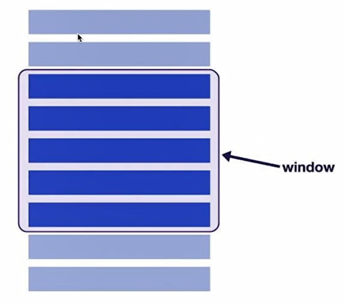
Windowing(窗口化)提高列表性能
![]()
What can windowing be used for
安装:
使用:
1
2
3
4
5
6
7
8
9
10
11
12
13
14
15
16
17
18
19
20
21
22
23
24
25
26
27
28
29
30
31
32
33
34
35
36
37
38
39
40
41
42
43
44
45
46
47
48
49
50
51
52
53
54
55
56
57
58
59
60
61
| import { FixedSizeGrid, FixedSizeList } from 'react-window'
import model from './model'
import React from 'react'
const items = []
for (let i = 0; i < 100; i++) {
items.push(model.map(m => <img src={m.image} alt={m.name} width={100} height={90} />))
}
const Row = ({ index, style }) => {
let styleExt = {
...style,
borderBottom: '1px solid #fff',
display: 'flex',
alignItems: 'center',
justifyContent: 'center',
}
return <div style={styleExt}>{items[index]}</div>
}
class ListComponent extends React.Component {
listRef = React.createRef()
scrollToRow = rowNum => () => {
if (rowNum <= 0 || rowNum > items.length) return
this.listRef.current.scrollToItem(rowNum)
}
render() {
return (
<div>
<button onClick={this.scrollToRow(50)}>Scroll</button>
/* 一维列表List */
<FixedSizeList
ref={this.listRef}
height={360}
width={400}
itemSize={120}
itemCount={items.length}
className={this.props.className}
>
{Row}
</FixedSizeList>
/* 二维列表Grid */
{/* <FixedSizeGrid
columnCount={1000}
columnWidth={100}
height={150}
rowCount={1000}
rowHeight={35}
width={300}
>
{Row}
</FixedSizeGrid> */}
</div>
)
}
}
export default ListComponent
|
windowing 的作用:
- 加载大列表、大表单的每一行严重影响性能
- Lazy loading 仍然会让 DOM 变得过大
- windowing 只渲染可见的行,渲染和滚动的性能都会提升
使用骨架组件减少布局移动(Layout Shift)
当相关组件数据还没有完全加载时,如果样式没有控制好,会导致组件没有完全撑开,当样式加载好之后,组件的布局会发生变化,对周围的组件也会造成影响,这个性能消耗比较高,我们应该尽量避免
骨架组件也叫 Skeleton 或 Placeholder(占位符),用来占位和提升用户感知,可以在 Google DevTools 里键入 ctrl + shift + p,输入 Layout Shift Regions
1
| npm i -D react-placeholder
|
1
2
3
4
5
6
7
8
9
10
11
12
13
14
15
16
17
18
19
20
21
22
23
24
25
26
| import ReactPlaceholder from 'react-placeholder'
class Contact extends Component {
render() {
const { ready } = this.state
const imageStyle = !ready ? { display: 'none' } : {}
let cardMedia = (
<CardMedia
component={'img'}
style={imageStyle}
className={this.props.classes.media}
image={this.props.image}
onLoad={this.becomeReady}
/>
)
return (
<div className={this.props.classes.root}>
<ReactPlaceholder ready={this.state.ready} customPlaceholder={<ContactPlaceholder />}>
/* ... */
</ReactPlaceholder>
{!ready && cardMedia}
</div>
)
}
}
|


